Getting Rid of Bookmarks Dropdown Menu
Hello,
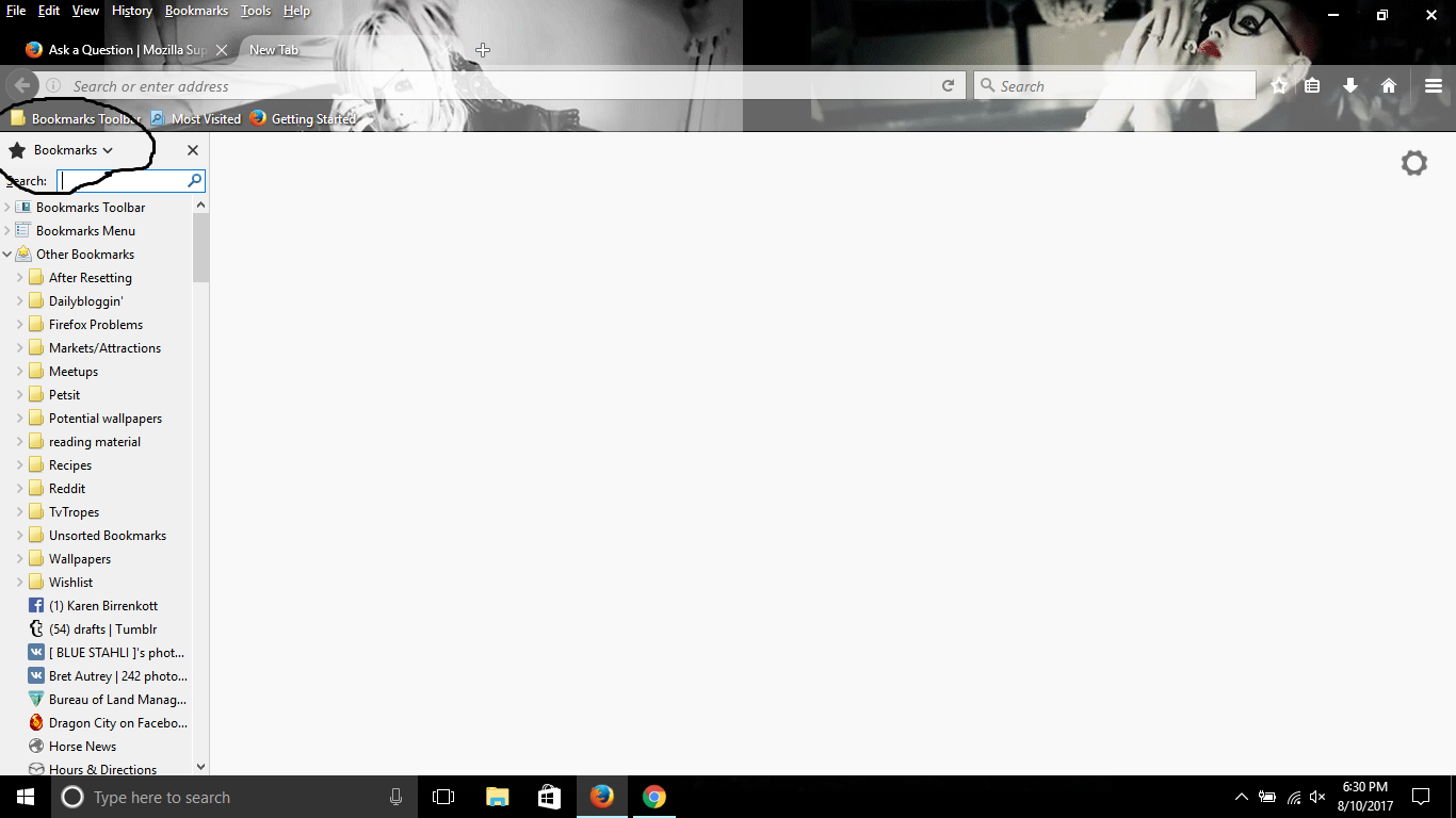
I just updated to Firefox version 55.0.2, and I would like to know how to get rid of the dropdown menu in the bookmarks sidebar, as shown in the screenshot. Not only do I not need it or see why it is needed (one can access History and Synced Tabs from the Menu Bar), but if I click on a link at the very bottom of the links visible (in my case, the link labeled as "Hours & Directions" with the Mazda logo), it "skips" to the link below it, and makes me click on that link instead. While scrolling down a few clicks is not much effort at all, it's something that I did not have to do, and something I feel I should not have to do to simply properly click a link.
Is there a way to get rid of the dropdown menu in the bookmarks bar?
Valittu ratkaisu
I think to address the problem of not having that bottom bookmark fully in view, you may need to collapse that whole heading area. This rule would leave a 4 pixel band you could hover your mouse over to access the drop-down and close button:
#sidebar-header:not(:hover) {
  height: 4px !important;
  min-height: 4px !important;
  background-color: #ace !important;
}
(I couldn't find a way to just float the close button over the search box, so this was the best thing I could come up with for recovering that vertical space.)
Lue tämä vastaus kontekstissaan 👍 0Kaikki vastaukset (7)
Add code to the userChrome.css file below the default @namespace line.
@namespace url("http://www.mozilla.org/keymaster/gatekeeper/there.is.only.xul"); /* only needed once */

#sidebar-switcher-target {display:none!important;}
- create the chrome folder (lowercase) in the <xxxxxxxx>.default profile folder if this folder doesn't exist
- use a plain text editor like Notepad to create a (new) userChrome.css file in the chrome folder (file name is case sensitive)
- paste the code in the userChrome.css file in the editor window
- make sure that the userChrome.css file starts with the default @namespace line
- make sure that you select "All files" and not "Text files" when you save the file via "Save file as" in the text editor as userChrome.css.
otherwise Windows may add a hidden .txt file extension and you end up with a not working userChrome.css.txt file
You can use the button on the "Help -> Troubleshooting Information" (about:support) page to go to the current Firefox profile folder or use the about:profiles page.
- Help -> Troubleshooting Information -> Profile Directory:
Windows: Show Folder; Linux: Open Directory; Mac: Show in Finder - http://kb.mozillazine.org/Profile_folder_-_Firefox
Valittu ratkaisu
I think to address the problem of not having that bottom bookmark fully in view, you may need to collapse that whole heading area. This rule would leave a 4 pixel band you could hover your mouse over to access the drop-down and close button:
#sidebar-header:not(:hover) {
  height: 4px !important;
  min-height: 4px !important;
  background-color: #ace !important;
}
(I couldn't find a way to just float the close button over the search box, so this was the best thing I could come up with for recovering that vertical space.)
@cor-el and @jscher2000
First off, thank you for your replies. Aside from this issue, the browser seems to be working in a satisfactory manner at the time of this writing.
However, I still have a couple of lingering questions.
1) For the solutions both of you posted, is there a way you could show me what the end result would look like, as well as give a dumbed-down, step by step guide on how to implement them? Unfortunately, some of us are a bit tech-dumb. haha.
2) Why was the feature even put in in the first place, when both History and Synced Tabs are easily accessible from View ---> Sidebars in the Menu Bar?
For #1, see the attached.
For step-by-step directions to create a userChrome.css file, you also could see this post: https://support.mozilla.org/questions/1170342#answer-993956
For #2, I don't know the answer. But I would point out that on Windows, the menu bar is not visible in the default configuration so people may have difficulty discovering this feature.
I wonder if extensions will be able to add to the sidebar menu?
Muokattu
@jscher2000
So for your particular solution, I would 1) Download Stylish 2) Type the url/address into the searchbar 3) copy and paste the code you listed (I assume the page that initially comes up would be blank?)
Is this the correct sequence of steps?
I suggest using a userChrome.css file, but if you wanted to use Stylish, you would:
(1) Install the extension and restart Firefox (2) Click its "S" icon on the toolbar, choose Write new style > Blank style (this opens an editing tab (3) Paste the rule in the lower area, then click Preview to confirm that it works (4) Assuming all is well, give it a name and click Save
@jscher2000 Thanks, just did it and checked it out, and it seems to be working well.


