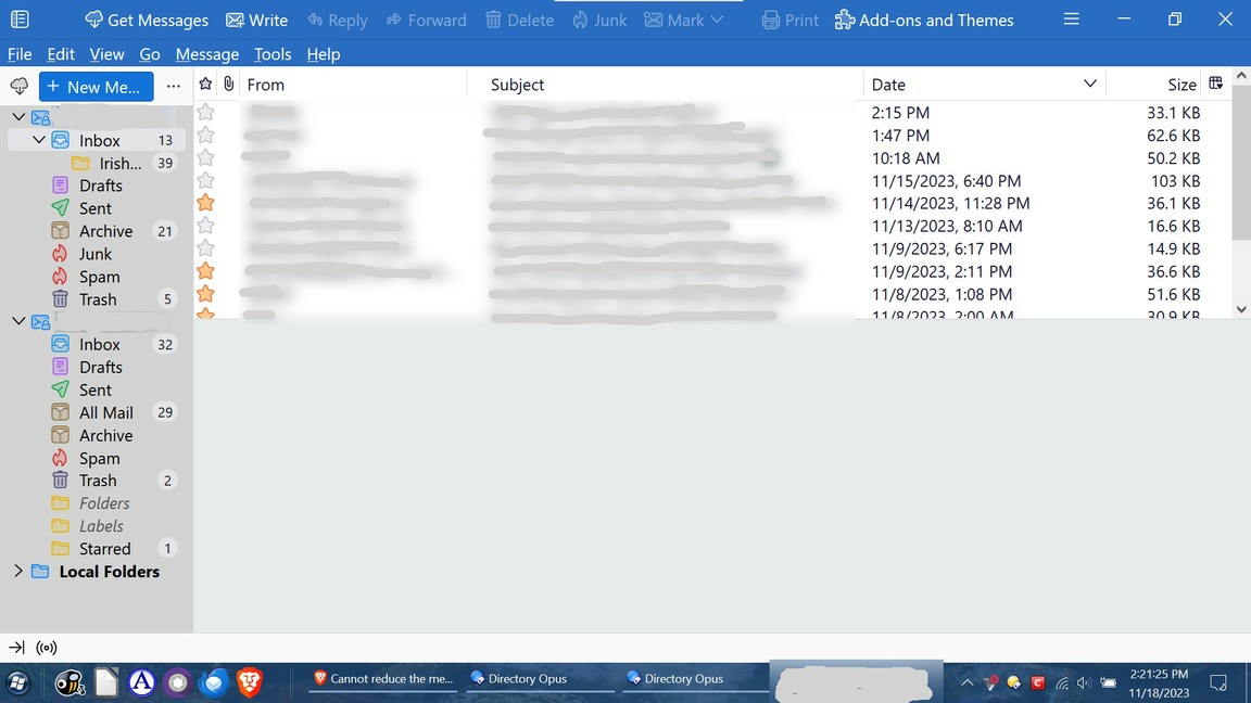
Cannot reduce the message list pane
I upgraded to version 115.2.2 (64 bits), on a Windows 10 OS.
I used to be able to reduce the pane of the message list, so that I could expand the contents of a selected message. But now it has a lower limit, where I cannot push the line up further.
Attached is an image showing the line of concern. I could drag it down, but no further up. How could I change this behavior?
Thanks!
Toutes les réponses (15)
The code works here along with Compact Headers. Test your userChrome with something that produces an obvious change, such as:
#folderPane {
background-color: lightgrey !important;}
the css file as constructed above does not change my display window
Thanks, sfhowes, for your response. Sorry to hear your assessment of notifying the T-bird developers: "I wouldn't expect there to be much interest in changing it". Sad they would be so unresponsive to a disappointing update they made that is negatively affecting folks here. I thought I might attempt adding a comment encouraging them to make a change, but the directions at Bugzilla for finding the correct way of doing that were beyond me. If anyone with more experience could do that, it would be appreciated. As for your assessment: "the css fix is easy to apply", it doesn't seem to be the experience of some of the other commenters on this thread, and certainly not for myself, as I am not a computer programmer.
The issue has been reported several times, e.g. https://bugzilla.mozilla.org/show_bug.cgi?id=1855611
Add comments or vote on the bug. I can't find anything that explains the reasoning for the existing situation or whether any changes are expected.
I updated the CSS file as the instructions said and it did not change the size of the display window.
Sorry it took me a while to get back here to reply to you, sfhowes.
The script for changing the color worked, but I'm still limited to the 9-1/2 lines showing in my inbox. I've attached a screenshot which shows Thunderbird without the mail header open, but of course when it is, it covers too much of the message, even with Compact Headers enabled.
Interesting thread and I agree fully. A while back I submitted my recommendation on the importance to stop requiring users to become programmers to get basic services. The site for recommendations and concerns is connect.mozilla.org and my post is at https://connect.mozilla.org/t5/discussions/stop-requiring-users-to-need-customizing-for-basic-services/m-p/41484 I encourage you to either add your comments to my post or to write your own. Getting attention to this issue is not going to be easy. You have the right to file a request in Bugzilla, but there are over 8,000 entries already.
I should also add that requests submitted on this forum go nowhere unless you do it. We are volunteers to help people use Thunderbird as it exists. No authority here for changes or enhancements.
AnAsHe said
Sorry it took me a while to get back here to reply to you, sfhowes. The script for changing the color worked, but I'm still limited to the 9-1/2 lines showing in my inbox. I've attached a screenshot which shows Thunderbird without the mail header open, but of course when it is, it covers too much of the message, even with Compact Headers enabled.
I checked it again and it still works. Copy your css here, enclosing it in preformat tags e.g.
<pre> code</pre>
Thanks All! "david" for the post at Bugzilla (I piled on as requested!); "sfhowes" for css code, link to video, and troubleshooting code; "tommcmackay" for clarifying the instructions. After finding that Betterbird really wasn't, I jumped back into TB and (for me, bravely) tried the fix! It didn't work the first time after restarting. I then replaced the css code for the message pane minimization with the css code for the the grayed folder pane on the troubleshoot and that worked. So tried again: replacing the troubleshoot code with the original css code for the message pane minimization and it worked! Thanks again...my tiny laptop screen survived the harmful radiation of the Supernova.
The pane minimization fix is now working for me after I did the same as richard1310. Thanks for posting Richard!
Hi again, just when I thought it was over (see above post), discovered more fallout from the Supernova explosion (supposed "improvement" to Thunderbird). Again, another bad coding design for those of us with small screens: Updated to 115.7.0 and can't read my address book info. Am stuck in "wide" in the View/Layout setting, and the address book pane to the left can't collapse any further, so half the pane is empty space, which forces the listings pane to the right which makes it barely viewable, and since it is not navigatable, longitudinally, with a slider, the info gets cut off and I have to zoom so small that I can barely read it and then only some of it. Any suggestions/help?
Could you post a screenshot of your addressbook view? I cannot duplicate it with my laptop. Thanks
I'm using an M2 macbook with Ventura 13.2. I tried tomcmackay's approach, but I already have two folders in my Profile folder: m1ngx5l9.default-release and 5idvb39f.default. Adding the css file to a new folder called chrome does not work. There is a chrome folder in the m1ngx5l9.default-release folder, but adding the css file to this folder doesn't work either.
I think that I'm creating the css file correctly (in BBEdit). But I'm not sure if I'm putting it in the right location?
Tried Tom McMackay's approach, cutting and pasting from his post:
/* height of threads pane */
threadPane {
min-height: 75px !important;
}
Didn't work.
Then noticed that the original css from sfhowes he copied had an extra special character in it (#):
/* height of threads pane */
- threadPane {
min-height: 75px !important;
}
This worked!
Uploading the last message changed the # to 1. "1. threadPane" needs to be "#threadPane"


