Replace context menu navigation icons with text only
Hi All,
Is there a way to replace the navigation icons on the context menu with their text-only counterparts?
I've tried the following code segments which provide less-than-optimal results.
This one which worked in FF 88, now removes the icons, but leaves 4 blank buttons in a row with no text...
#context-back image,
#context-forward image,
#context-reload image,
#context-stop image,
#context-bookmarkpage image {display: none !important;}}
This one completely removes the options, but I would like to keep them, and replace them with their text counterparts
#context-navigation,
#context-sep-navigation {
   display:none !important;
}
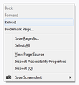
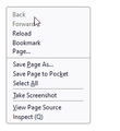
Please see attached images for the before and after of what I'm trying to achieve.
Might be nice to have the blank icon column to the left of these 4 items so they all line up with the items below, but I can live without that if it's not possible.
Any help is appreciated!
Slouch द्वारा
All Replies (17)
Try this CSS code in userChrome.css.
/* Content Area Context Menu - Navigation Vertical Text */
#context-navigation,
#context-navigation > menuitem{
  flex-direction: column;
}

/* hide images */
#context-back image, #context-forward image,
#context-reload image, #context-stop image,
#context-bookmarkpage image{
  display: none !important;
}

/* show text labels */
#context-back:after, #context-forward:after,
#context-reload:after, #context-stop:after,
#context-bookmarkpage:after{
  content: attr(aria-label) !important;
}

/* left-justified */
#context-navigation .menuitem-iconic{
  justify-content: start !important;
  align-items: start !important;
  padding-inline-start: 31px !important;  /*adjust to line up*/
}
EDIT: switched left-justify to padding-inline-start
cor-el द्वारा
Yes, that's excellent cor-el, thank you :)
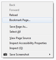
I played with the margin-inline-start a bit to get the text to line up, and the image below is what it produces. The icon column is missing, so the highlight bar doesn't get activated when the mouse pointer is in that column area as with the other choices below, but this is good enough for my needs. In fact, if I set the margin at 0, it works perfectly anyway, as in the second image.
Slouch द्वारा
On Linux I'm seeing margin-inline-start.
On Windows they might be using padding-inline-start. You can possibly use the Browser Toolbox to check the rules for a regular menuitem > .menu-text and for menuitem.menuitem-iconic
cor-el द्वारा
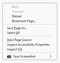
padding-inline-start worked perfectly. see image below. thank you so much.
Slouch द्वारा
I hadn't noticed the issue with hovering. This works for me on Linux. Does this work on Windows as well or do you need a different value ?
- padding-inline-start: 27px !important;
I'm using padding-inline-start: 31px !important; and that's what lines up these 4 top items on the menu with the other items below.
Thanks. I will edit my above reply.
Except it looks horrible in Windows 10 (see image below). Only looks good in Windows 7. Not sure why there's so much difference between Windows OS's. In Windows 10, the menus corners are rounded, there's no left column for icons, and the navigation items on top are shifted way to the right and have too little padding (too close together).
Note: On Windows 7 I'm using FF 115 ESR. On Windows 10, I'm using FF 125.
Slouch द्वारा
Again, editing this reply because the context menu looks different in FF 115 ESR and FF 125 both on Windows 10... two different results with the same userChrome.css as FF115 ESR on Windows 7.
I now have three very different context menus all with the same userChrome.css file.
I have to assume "padding-inline-start" works differently in Windows 10 than in Windows 7 - and differently between FF15 ESR and FF 125 on Windows 10?
Slouch द्वारा
Are you sure that copied all the code as you appear to be missing flex-direction You may need to add the !important flag.
#context-navigation,
#context-navigation > menuitem{
  flex-direction: column !important;
}
I noticed that I need to add an extra selector to tighten up the context menu.
menupopup > menuitem,
menupopup > menu,
menugroup > menuitem {
  padding-block: 1px !important;
}
I missed your above edited reply. Apparently you do not get the margin or padding for a menuitem without icon like items that have an icon get. Does this happen in all menus that have mixture of icons and only text or do you have other rules in userChrome.css (did you test it with only this code) ?
You will have to take a loser look with the Browser Toolbox.
OK, now both Windows 10 versions look the same, as in the image below.
The !important flag may be important for Windows 10.
And the spacing is better, more uniform.
However, the first four items are still shifted to the right. So apparently padding-inline-start works differently in Windows 10 than in Windows 7?
Slouch द्वारा
I disabled the screenshot add-on in Windows 10 to test whether the camera icon is causing any issues, but the menu looks the same without the icon item in the last position. See image below.
Slouch द्वारा
Now, with the same code (latest mods), there are 2 versions of the context menu in Windows 10.
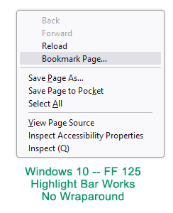
In FF 125, the Bookmark Page... item correctly extends across the menu, and the highlight bar works. My mouse pointer is directly over the Bookmark Page... item.
In FF 115 ESR, the Bookmark Page... item wraps around because the menu width seems to short, and the highlight bar does not appear. My mouse pointer is directly over the Bookmark Page... item. The bookmark function still works, as do Back, Forward and Stop... the highlight bar just does not appear.
In both Windows 10 versions, the top 4 items are still shifted too far to the right.
Windows 7 still looks fine.
Current code in all three...
/* Content Area Context Menu - Navigation Vertical Text */
#context-navigation,
#context-navigation > menuitem{
  flex-direction: column !important;
}
/* hide images */
#context-back image, #context-forward image,
#context-reload image, #context-stop image,
#context-bookmarkpage image{
   display: none !important;
}
/* show text labels */
#context-back:after, #context-forward:after,
#context-reload:after, #context-stop:after,
#context-bookmarkpage:after{
   content: attr(aria-label) !important;
}
/* left-justified */
#context-navigation .menuitem-iconic{
   justify-content: start !important;
   align-items: start !important;
   padding-inline-start: 31px !important;
}
menupopup > menuitem,
menupopup > menu,
menugroup > menuitem {
  padding-block: 1px !important;
}
Slouch द्वारा
You need to adjust padding-inline-start to a lower value (possibly 0px) in Windows 10 to make these items start at the left end.
padding-inline-start: 31px !important;
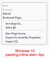
Yes, apparently "11px" is the magic number for Windows 10, and "31px" for Windows 7.
0px places the items too far to the left.
See two images below.
Is this typical to have different padding/margin numbers across different Windows versions?
Slouch द्वारा
There is still the issue with FF 115 ESR on Windows 10, with the "Bookmark Page..." item wrapping around and the highlight bar not appearing on mouseover. The highlight bar does appear on the choices below the first four. Any ideas are appreciated.
Slouch द्वारा


