Appearance of new Firefox 29.0 - the worse ever!
My God! What have you done the the Firefox toolbar of Firefox 29.0? Why the hell do you try to mimic Google Chrome? What have you done to the nice Firefox toolbar with the orange upper left corner with all the Options, History, Help, About, etc? I want the 28.0 toolbar! I hate Google Chrome and you try to mimic them. Shame on you!
Chosen solution
Try the Classic Theme Restorer extension:
https://addons.mozilla.org/firefox/addon/classicthemerestorer/
All Replies (10)
What's your actual problem? Is there something you wish us to provide support with?
Or did you just want to get this off your chest?
Can't you read? I will repeat: What have you done the the Firefox toolbar of Firefox 29.0? Why the hell do you try to mimic Google Chrome? What have you done to the nice Firefox toolbar with the orange upper left corner with all the Options, History, Help, About, etc? I want the 28.0 toolbar! I hate Google Chrome and you try to mimic them. Shame on you!
Chosen Solution
Try the Classic Theme Restorer extension:
https://addons.mozilla.org/firefox/addon/classicthemerestorer/
It's a little confusing to me too. A lot of Firefox fixes begin, "click the orange box at the upper left...." well, since it is no more, is singin' with the choir invisible, is a DEAD PARROT, it's nice that I finally got the news from Firefox to check that box to the upper RIGHT. It's still confusing though, because the options don't look the same.
When will designers take into account that some people are visually oriented and form habits based on their visual memories ...? [sigh]
with respect, i don't think you [and other v.29+] proponents are replying to the essential question: why did mozilla/firefox make these visual changes, which require users to substantially reorient their use of the browser?
it's the same kind of question which good reporters ask: why did this happen? what was the rationale? were you driven by the competition? what assumptions were involved when your developers decided to make the changes? why didn't you offer a version with security improvements, and leave the rest alone?
this long-time firefox user--and fan--is upset. it seems that you're taking the microsoft route: change versions, systems, et al., and the user be damned.
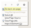
Note that that will be more changes in future Firefox versions that need getting used to. For instance Firefox 32 will show some icons in the right-click context menu instead of text labels for the Back and Forward and Reload and Bookmark This Page items.
Improving Context Menus in Firefox Desktop:
Modified
hi, cor-el, thanks for your alert about future changes in firefox.
given the annoying firefox update pop-ups [or whatever the proper name], why doesn't firefox survey users, with a sample that has a relatively low margin of error, when it introduces major changes like v.29 & 30? just select a qualified survey research person and write a program that would eliminate responses from cranks, moaners and the like--or, whatever is desired.
and, thanks for reading this
We do survey users, we surveyed tens of thousands of users before and after launching Firefox 29, and on top of that we monitored the feedback we received through organic sources. Largely, users were more happy with Firefox 29 and 30 than with previous version of Firefox.
thanks for the reply to my comments. thanks to firefox for making available a staff member with a human face. i'm glad that a lot of data exists on your support website.
i hope that you and other firefoxers monitor these forums consistently and, occasionally post a relevant comment
having said that, why not tell users more about the surveys: what were the questions; how many people were sampled [and the margin of error].
what are "organic sources"?
as to your statement, "Largely, users were more happy with Firefox 29 and 30 than with previous version of Firefox, "words like "largely" or "many" all too often are used by journalists--and, i guess, the rest of us, as an excuse for not knowing or taking the time to answer the question, "how many is many," or, "largely," as compared to what?
please share wtih us the rationale for not being more specific.
i love firefox, but i wish you and your colleagues would be more specific and detailed in your responses [and identify yourselves as firefoxers].
thanks for reading this.
Well we do publicly talk about how we go about gathering feedback, for example, https://blog.mozilla.org/useradvocacy/2014/03/18/the-next-big-thing-for-firefox-and-how-we-listen-to-our-users/.
We don't spread the word about the surveys, because they are presented only to a random 3% of our users. If users knew there were surveys then they would get flooded by users just wanting to voice their concerns and the data would be biased.
For an actual number comparison, Firefox 28 was rated 3.9 , 29 was rated 3.9 and 30 was also rated 3.9 (on a 5 point scale). Basically the same rating across all 3 releases using the same testing methodology. If there was such a massive outpouring of hatred as you say, then the overall rating would have gone down. Each 1 star rating takes 7 5 stars to reverse it.
Organic sources are sources of feedback (like input) that are always there and don't prompt users to give feedback, they just receive it when a user looks for a way to give feedback. They always skew very negative since an unhappy user is more likely to look for a way to give feedback than a happy user.

