Issue with menu type and bookmark images when using Mac transparency
Closing as a duplicate of /questions/1159272 -J99
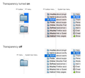
A while ago I upgraded my Mac to OS X 10.10.5.. Two weeks ago I also switched to using the system’s transparency option for menus en windows. In Firefox I suddenly noticed a few things (see also the attached images below):
When Transparency is turned ON:
1. The rendering of type in the FF toolbar pull down menus is noticeably more bold than in the menus from the system bar.
2. Bookmark images in the FF toolbar menus are much darker then those in the system bar menus (in a mouseover they become lighter again).
When Transparency is turned OFF:
Same differences, although less outspoken. But no difference in passive state and mouseover.
Besides that the effect is ugly and unattractive, the type becomes less readable (cluttered and unsharp), especially on dark backgrounds.
Safari and Chrome don't have this problem.
It should be noted that I still use a Cinema HD screen, not a retina screen.
Question: Is this intended behaviour or an issue that should be reported? Is there some setting in FF that can correct this?
Modified
All Replies (1)
X-Link See also
- Menu type and bookmark images too dark when using Mac transparency /questions/1159272
- & Why am I not getting support? /questions/1160620
Note we do not have, and have not had a staffed helpdesk, for a while now. Currently any escalation guidelines are totaly outdated.


