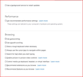
Ticks not showing in square options boxes in "Settings"- FF 91.0
I'm trying to set or change some of the settings in FF 91.0. My understanding is that checking a box should produce a coloured tick in that box. However, when I tick an option box, the border appears to change from pale grey to a darker grey, but no tick is shown. The two screenshots show before and after.
I have of course tried this in Safe Mode, but that makes no difference, and changing themes doesn't do anything either.
The net effect is that it is very difficult to see whether an option or setting is set ON or OF, when no tick is shown in the relevant box.
All Replies (5)
Solved my own problem.
I have a userchrome.css stylesheet to enable tabs to show below the bookmarks toolbar. At the same time, the about:config setting for browser.proton.enabled was set to fales. Setting it to true enables the tickboxes to show ticks. I am still using my chrome .css for the tabs, though.
How did you get and use the userchrome stylesheet. I had the same problem also returned browser.proton.enabled to true. Of course now I am back to the awful new design that makes it hard to see the tab bar.
I had the same problem and returning browser.proton.enabled to true does show the tick boxes but now I am back to the god-awful mess at the top of the page where everything is a shade of gray which really bothers my eyes. So I'll toggle back & forth as needed.
I do not know whether this will be applicable to everyone else, but I am doing the following:- 1) using a stylesheet to set tabs below the Bookmarks toolbar 2) have about:config settings for these entries set thus:- ii. Set the about:config entry “browser.proton.enabled” to “true” when it was previously false. This brings back the tick in the tick boxes on Settings iii. Set toolkit.legacyUserProfileCustomizations.stylesheets preference to true . This enable the css for my below-bookmarks tabs. 3) I'm using different themes, which work fine. The one in the example screenshot is "Beach Colour Pastels".
There is a workaround css described here: https://www.askvg.com/tip-new-working-method-to-restore-classic-theme-and-ui-in-firefox-91-and-later-versions/
I have tried this, but it doesn't do quite what I want. It may, however, work for others. In essence, it appears to take the default Windows colours set in W10>Settings>Personalisation>Colours>Choose your accent colour.
One obvious problem is that if "browser.proton.enabled" is off (false), then the problem with missing ticks in Settings will persist. This is not mentioned in the SVG workaround notes.
I attach a shot of what my current setup looks like. It is almost the same as I've used in FF for years. The top title bar dark blue is derived from the Windows settings as above. The next menu bar pale blue from theme, and the bookmarks and tab bar also derive their colours from the theme.
I haven't experimented with it, but I would assume that even with the proton switch set true, and no userChrome.css in place, any theme would still supply the colouration to the different bars i.e. the theme overrides the proton colour default, which I understand is grey. Someone will need to see if this is so.
One of the delights of Firefox has been the numerous add-ons, themes and the ability for the user to configure it to exact personal preferences; effectively to "skin" it whilst all the programme features, especially security, work nicely beneath. The frequent breaking of add-ons has greatly reduced with the various standards applied to them, but it is a pity if Mozilla decide to reduce or remove some major elements of customisation, and apply their colours and settings.
Piscator modificouno o
Answers above.
Piscator modificouno o


