Firefox Picture-In-Picture
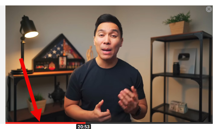
The Firefox built-in Picture-In-Picture works great and has great pictures, much better than Chrome addon PIPs. I noticed today it has gone through an update and the first difference I noticed is the "Back to tab" button has moved from bottom center to top left. As I said, the PIP of Firefox has a great design and features, but is missing one feature that would make it perfect. Can you please add a RED PROGRESS BAR at the bottom of the PIP box. For example, there is an "Enhancer for YouTube" addon PIP (not a regular PIP, but other type of PIP that pops up when scrolling down to comments section) which has that and it's very useful (please see attachment). And if that feature is added, the ideal and logical design would be to show the "red progress bar" while hovering over the PIP box, not an always-showing feature, just like a YouTube video red progress bar works.
Thank you, Arthur
All Replies (9)
I'd like to see the "play/pause button" on the PiP window be placed more slightly to the left so that the "play/pause button" is more centered.
TheThingKing மூலமாக
thethingking91 said
This would be good but also I'd like to see the "play/pause button" on the PiP window to be placed more slightly on the left to make the "play/pause button" more centered.
I guess the reason it's off centered is because when they moved the "Back to tab" button from bottom center to top left, the play/pause button became off centered.
thethingking91 said
This would be good but also I'd like to see the "play/pause button" on the PiP window to be placed more slightly on the left to make the "play/pause button" more centered.
Wow, that was fast, looks like the Play button off-center problem is already solved.
Note that there is a media.videocontrols.picture-in-picture.improved-video-controls.enabled pref available on the about:config page.
cor-el said
Note that there is a media.videocontrols.picture-in-picture.improved-video-controls.enabled pref available on the about:config page.
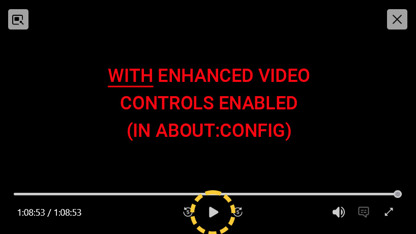
Well what do you know, looks like the feature I wished existed already does through enabling enhanced video controls in about:config. As they say, Americans are too busy sweating over "first-world problems" while third-world countries are struggling for clean drinking water, but in either case, THANKS A LOT for pointing this hidden gem out, it's really useful for me as I use PIP every single day extensively. I appreciate it!
Arthur said
thethingking91 said
This would be good but also I'd like to see the "play/pause button" on the PiP window to be placed more slightly on the left to make the "play/pause button" more centered.Wow, that was fast, looks like the Play button off-center problem is already solved.
How is the Play/Pause button off-center problem solved? Running the latest 111.0 version here and the Play/Pause button remains slightly off-center by a few pixels.
TheThingKing மூலமாக
thethingking91 said
Arthur said
thethingking91 said
This would be good but also I'd like to see the "play/pause button" on the PiP window to be placed more slightly on the left to make the "play/pause button" more centered.Wow, that was fast, looks like the Play button off-center problem is already solved.
How is the Play button off-center problem solved? Running the latest 111.0 version here and the Play button remains slightly off-center.
I checked and I have the same version 111.0 and my play/pause button is perfectly centered (it wasn't yesterday, I have no idea what happened). See attached screenshots of the Firefox PIP with and without advanced video controls activated, which BTW I just learned about today from another user who I am thankful to (see posts above) and also BTW activating the enhanced controls has nothing to do with the play/pause button being centered. My button became centered even before I learned about the advanced control features.
Arthur said
thethingking91 said
Arthur said
thethingking91 said
This would be good but also I'd like to see the "play/pause button" on the PiP window to be placed more slightly on the left to make the "play/pause button" more centered.Wow, that was fast, looks like the Play button off-center problem is already solved.
How is the Play button off-center problem solved? Running the latest 111.0 version here and the Play button remains slightly off-center.
I checked and I have the same version 111.0 and my play/pause button is perfectly centered (it wasn't yesterday, I have no idea what happened). See attached screenshots of the Firefox PIP with and without advanced video controls activated, which BTW I just learned about today from another user who I am thankful to (see posts above) and also BTW activating the enhanced controls has nothing to do with the play/pause button being centered. My button became centered even before I learned about the advanced control features.
Hmm.. Maybe it's just me being nit picky about the play/pause button being slightly off-center because my Firefox PiP looks exactly the same as yours.
The advanced video seek control buttons for going back or forward by 5 seconds is great. I learned to activate the function via about:config a few months ago from a post on Reddit but would have never known otherwise. It's time Firefox enable the feature by default in the next update because I suspect lots of people don't know about the PiP advanced video seek control buttons either.
TheThingKing மூலமாக
TheThingKing said
InArthur said
thethingking91 said
Arthur said
thethingking91 said
This would be good but also I'd like to see the "play/pause button" on the PiP window to be placed more slightly on the left to make the "play/pause button" more centered.Wow, that was fast, looks like the Play button off-center problem is already solved.
How is the Play button off-center problem solved? Running the latest 111.0 version here and the Play button remains slightly off-center.
I checked and I have the same version 111.0 and my play/pause button is perfectly centered (it wasn't yesterday, I have no idea what happened). See attached screenshots of the Firefox PIP with and without advanced video controls activated, which BTW I just learned about today from another user who I am thankful to (see posts above) and also BTW activating the enhanced controls has nothing to do with the play/pause button being centered. My button became centered even before I learned about the advanced control features.
Hmm.. Maybe it's just me being nit picky about the play/pause button being slightly off-center by a few pixels because my Firefox PiP looks exactly the same to yours.
The advanced video seek control buttons for going back or forward by 5 seconds is great. I learned to activate it via about:config a few months ago from a post on Reddit but would have never known otherwise. It's time Firefox enable the feature by default in the next update because I suspect lots of people don't know about the PiP advanced video seek control buttons either.
Well that's interesting, because yesterday, when you first mentioned about the play/pause button being off-centered, I checked mine, and it was off-center by a lot, like more than half an inch. Then it became centered, I don't know was it an update, or was it just one of those things when things get refreshed, problems disappear. I am picky myself, but if your play/pause button is off by a millimeter, I wouldn't pay attention to it, and thus not notice it.
I'm sure lot of people don't know about this great advanced control feature. I myself was very happy to discover it as I use PIP every single day extensively (I'm using it as we speak). Besides the -5/+5 feature, which is very very useful, I was looking for a feature that showed the progress bar on the PIP window. So this advanced control not only has the progress bar, it also shows the current/total time, -5/+5 buttons and a button to go from PIP directly to Full Screen, something that is very useful too. In short, this advanced features are wonderful and maybe should be on by default. I'm thinking the reason it's not is because maybe most people don't want them, and it's available to be enabled for those who need them.


