Menu type and bookmark images too dark when using Mac transparency
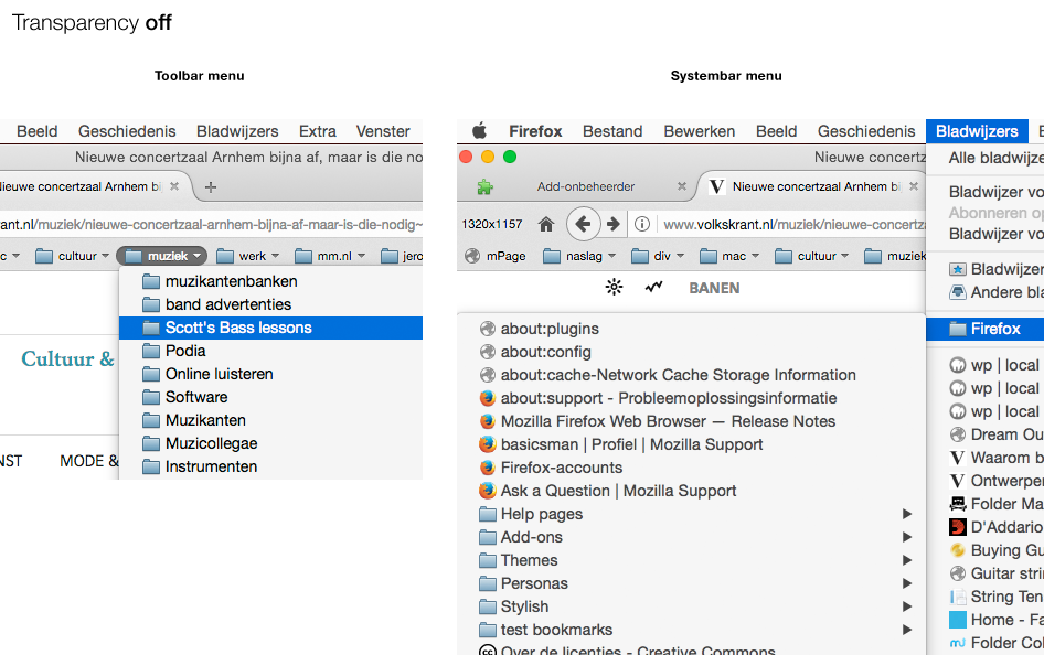
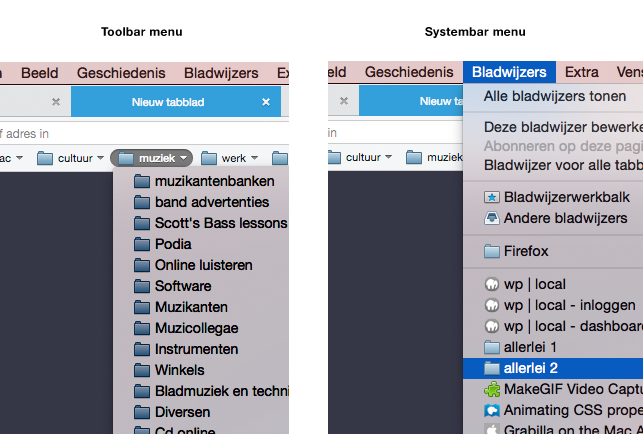
Since I started using my Mac system’s transparency option for menus en windows I noticed this in Firefox (see also attached images):
1. In the FF toolbar bookmark pull down menus the rendering of type is noticeably more bold and unsharp than in the menus coming from the system bar.
2. Bookmark images in the FF toolbar menus are much darker then those in the system bar menus (in a mouseover they become lighter again, more like they should be, but still darker).
The type becomes less readable (cluttered and unsharp), especially on dark backgrounds, apart from that the effect is ugly and unattractive. When transparency is turned off things look better, but the differences are still there. Safari and Chrome don’t have this issue.
I’m using a Cinema HD screen, not a retina screen.
Addition (my actual questions):
- Can someone confirm this issue?
- Is there a setting/userstyle that can correct this?
- Or can I report this as a bug?
Изменено
Все ответы (13)
Hi
Your issue seems a bit more complicated and requires more investigation.
We're currently looking into it and we'll get back to you with more details ASAP. Please understand that escalations can take up to 72 hours for a response, but no longer.
Okay, thank you for your responding. Good to hear someone is looking into it! I’m not shure what ’escalation’ means in this context, though, but you can explain that later.
Thanks again.
I’m not shure what ’escalation’ means in this context, though, but you can explain that later.
Kicking it up to HelpDesk, essentially.
You could try one of the built-in lightweight themes (e.g. compact light) or another lightweight theme to see if that has effect.
I just tried Compact Light. No difference unfortunately (see first image).
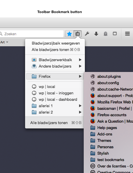
In addition: when using the toolbar Bookmark Button the rendering of the bookmarks is mixed (see second image).
Earlier I also tried a restart in Safe mode, to no avail
Moses said
I’m not shure what ’escalation’ means in this context, though, but you can explain that later.Kicking it up to HelpDesk, essentially.
I understand now. Thanks.
Forum Note - RIP Help-Desk
There is no HelpDesk !!
IMHO We should not promise further responses to a question, other than to say we are attempting to draw contributors attention to the question.
FACT We have had no functional helpdesk for about a year now and for many months escalation only means trying yo draw it to the attention of other contributors.
Of course right now we are on the old software, when in some weeks we move back to the new software things may change slightly but I know of no plans to reinstate any help desk.
We do have some documentation on escalation but it is outdated. We have or had very little documentation on the new forum software, and new forum procedures. Despite migrating three month ago that is still work in progress. It may have improved by the time we roll forward.
I know somewhere there is a hard to find confirmation from Patrick the MoCo manager saying HelpDesk is no more. The best I can find right now is a discussion that includes Rachel aka guigs who effectively was the helpdesk recently & a pre migration discussion
- Escalation Guidelines > Discussion > Does not reflect reality, Is it even appropriate to the new forum.
https://support.mozilla.org/en-US/kb/escalation-guidelines/discuss/6774 - Rachel started: Feedback Requested to this thread to be Crisis Management or Escalations https://support.mozilla.org/en-US/forums/support-forum-contributors/712274
A couple of years ago nearly we had a peak of nearly 100% of questions getting an answer. That dropped to more like 80%. While we are on this Kitsune software you can see the interactive metrics in graphical form using the link:
I attach a screenshot, the thumbnail expands when clicked on.
John99 said
Forum Note - RIP Help-Desk
There is no HelpDesk !!
Okay, I see. Thanks for clarifying.
Although much of it seems to to deserve an internal discussion and action (at Mozilla and Support I mean), instead of posting it here… ;-)
Without wanting to dilute this thread with another subject it might be good to say that the way this Support section is set up creates expectations (with innocent outsiders/users like me) that might not be possible to meet... The setup (and name Mozzila Support alone - not ‘Mozilla Forum’) suggests a thorough organization and professional goals. There’s also (for me) confusion about what all these tabs ‘Attention needed’ ‘Done’ and solved percentages etc actually mean - they should be of no concern to the innocent visitor nor helps him, but create this image of thoroughness and high expectations. And disappointment/frustration if your question remains unanswered for a long time. I was puzzled (for example) when I didn’t found my question under ‘Attention needed’ anymore… had it been ‘lost’, unsolvable, unimportant, or what?
Given the situation you outline, it would be good that at least there should be a note somewhere, stating clearly how it works and what can be expected.
I care about Firefox, so I hope the coming changes you mentioned will work out well.
..uhh, maybe we should turn back to the original subject ;-)
Yes we need to try to answer the original question but unfortunately the majority of questions are never solved.
As a user asking advice in our forum you are welcome to join in our open discussions about the forum. Most who answer questions probably started out by asking questions.
The issue still existed after creating a new FF profile.
I've just filed a bugreport on the issue:
bug 1366587 - https://bugzilla.mozilla.org/show_bug.cgi?id=1366587
Hopefully it helps.
The bug got marked p5 I guess that is an acceptance of the fact it may be a problem needing fixing, but unlikely it will be fixed.
John99 said
The bug got marked p5 I guess that is an acceptance of the fact it may be a problem needing fixing, but unlikely it will be fixed.
Hi John, thanks.
I already thought it means something like that, although as a bug It’s still unconfirmed.
Since it’s something showing in one of the interface's most used features, I thought it would get some priority. Alas. I guess a little nudging won’t help here?


